BRIC Community Media TV & Film Pitch Series—Practice Your Pitch!

The panelists (counterclockwise l. to r.): Dui Jarrod, Skye MacLeod, Craig T. Williams, Squeaky Moore and Michael Pinckney, 
Per BRIC's website: "BRIC is the leading presenter of free cultural programming in Brooklyn, and one of the largest in New York City. We present and incubate work by artists and media-makers who reflect the diversity that surrounds us. BRIC programs reach hundreds of thousands of people each year."

"BRIC's two Community Media TV Networks—Brooklyn Free Speech and BRIC TV—come together to bring you a unique opportunity; the BRIC Community Media TV & Film Pitch Series. Now in its third year, the series was created with one goal in mind— to turn media dreamers into media makers."


I jumped at this opportunity to be a spectator at the "Communicating Your TV and Film Ideas" pitch presentation practice before a panel of professionals. The panel was thoughtful and respectful with its feedback and I picked up a lot of helpful hints.


Here's what I learned about pitching:

  1. Edit your pitch (for this presentation, the time limit was 3 minutes)

  2. Be certain and definitive about your choices

  3. The protagonist and antagonist must have names

  4. Choose a genre

  5. Know the characters and their situations

  6. Choose a title

  7. Need to lead with a story and character NOT an issue. Explain the world/location.

  8. Explain to the pitch audience what they can expect to see moment to moment

  9. Know the target audience

  10. Be enthusiastic and confident in your presentation

  11. Take the pitch audience on a journey with you

  12. Pitch with positivity

  13. Need to communicate the protagonist's wants and everything about the character including their conflicts

  14. Don't apologize, qualify nor explain. Just start the pitch.

  15. The protagonist needs traits that conflict with their goal

  16. Know who is in the world you created and why should anyone watch

  17. Memorize the pitch so the audience can feel it

  18. Can't pitch a comedy without making the panel laugh

  19. Suggest how episodes play out

  20. The pitch should be a story

  21. Bring the panel along slowly e.g. "This happens in the pilot. This happens mid-season then this happens at the end of season one."

  22. The panel needs to know what they're getting with your project

  23. All descriptions in the pitch should be associated with the protagonist's journey 
I'll be attending the next pitch presentation on October 19. It has a different panel and I'm looking forward to picking up even more tips that I'lll share with you. And I hope to be present for the final presentation to the BRIC TV executives on November 14.

If you like this post, leave a comment below (I respond to all comments!) and/or click the "Follow" button on the right! 

Thanks for reading!

NY Comic Book & Graphic Novel Creators Meetup Presents: Ivan Cohen


I had the pleasure of attending the NY Comic Book & Graphic Novel Creators Meetup "Ivan Cohen Talks About EVERYTHING!"

Ivan Cohen is a writer, editor, and entertainment executive who has worked for DC Comics, Marvel Comics and Disney among others.


Here are my takeaways:
  1. If you're entering a position at a company, it's best to follow someone who was bad at that job. This makes it easier for you to perform better than your incompetent predecessor.

  2. The time it takes for bad work to be made is the same as that for good work

  3. Humility is good—to a point—and it's important to be nice to EVERYONE you encounter

  4. Don't talk continuity with the professional comic creators because you'll come off as a "fanboy"

  5. When considering what to charge for your freelance work, never undervalue your time. Price yourself fairly.

  6. It's hard to make a living doing just one thing in this industry

  7. Before you pitch an idea, make sure you can answer this question: "Why is this project creatively valid?"

  8. It's helpful to already have a following if you want your project to be made by a major company
I'll continue to share helpful tidbits from the Meetups I attend.

If you like this post, leave a comment below (I respond to all comments!) and/or click the "Follow" button on the right!

Thanks for reading!

Michael Mentler—Figure Drawing in the Renaissance Tradition Lesson One


Here are what I think are the key takeaways from Michael Mentler's Figure Drawing in the Renaissance Tradition Lesson One.

This first lesson is a general introduction to the overall course.

 [NOTE—Since this is a paid course, I don't want to show screenshots nor give away for free too much of Mentler's course]:

  1. LIFE
    • L=Language. visual and verbal
    • I=Intent (imitation, intellect, interpretation, intuition, imagination/invention)
    • F=Form. sphere, cone, cylinder, cube
    • E=Expression/Empathy. Combining the 5 levels of intent—seeing, knowing, selecting, feeling, creating
  2. The visual language of drawing uses Points, Lines, Planes, Forms, Images and Compositions. Points exist in nature, lines do not. Line is only the edge of a plane. Plane is the edge of a form. A point is a line on end; as the point turns it reveals the length of the line. Forms create images.

  3. Use mass conceptions (forms) to understand the sections of the body.

  4. GET OUT OF YOUR COMFORT ZONE!

  5. Don't entirely erase a line that's a "mistake" to ensure that you don't re-draw the same mistake.

  6. It's important to walk around the model to see it 360° to fully understand its dimensionality. 

In a future post, I'll share my key takeaways from Mentler's Lesson Two.

If you like this post, leave a comment below (I respond to all comments!) and/or click the "Follow" button on the right!

Thanks for reading!

Designing a Logo–Step 3: Thumbnail Sketches/Brainstorming

The first step of designing a logo was research.

The second step was word associations to brainstorm ideas.

The third step is thumbnail sketches.

Before doing these sketches, I looked up "logo design." I came across this list which was incredibly helpful in guiding my process:

  1. Do not use more than three colors.
  2. Get rid of everything that is not absolutely necessary.
  3. Type must be easy enough for your grandma to read.
  4. The logo must be recognizable.
  5. Create a unique shape or layout for the logo.
  6. Completely ignore what your parents and/or spouse think about the design.
  7. Confirm that the logo looks appealing to more than just three (3) individuals.
  8. Do not combine elements from popular logos and claim it as original work.
  9. Do not use clipart under any circumstances.
  10. The logo should look good in black and white.
  11. Make sure that the logo is recognizable when inverted.
  12. Make sure that the logo is recognizable when resized.
  13. If the logo contains an icon or symbol, as well as text, place each so that they complement one another.
  14. Avoid recent logo design trends. Instead, make the logo look timeless.
  15. Do not use special effects (including, but not limited to: gradients, drop shadows, reflections, and light bursts).
  16. Fit the logo into a square layout if possible, avoid obscure layouts.
  17. Avoid intricate details.
  18. Consider the different places and ways that the logo will be presented.
  19. Invoke feelings of being bold and confident, never dull and weak.
  20. Realize that you will not create a perfect logo.
  21. Use sharp lines for sharp businesses, smooth lines for smooth businesses.
  22. The logo must have some connection to what it is representing.
  23. A photo does not make a logo.
  24. You must surprise customers with presentation.
  25. Do not use more than two fonts.
  26. Each element of the logo needs to be aligned. Left, center, right, top, or bottom.
  27. The logo should look solid, with no trailing elements.
  28. Know who is going to be looking at the logo before you think of ideas for it.
  29. Always choose function over innovation.
  30. If the brand name is memorable, the brand name should be the logo.
  31. The logo should be recognizable when mirrored.
  32. Even large companies need small logos.
  33. Everyone should like the logo design, not just the business that will use it.
  34. Create variations. The more variations, the more likely you are to get it right.
  35. The logo must look consistent across multiple platforms.
  36. The logo must be easy to describe.
  37. Do not use taglines in the logo.
  38. Sketch out ideas using paper and pencil before working on a computer.
  39. Keep the design simple.
  40. Do not use any “swoosh” or “globe”symbols.
  41. The logo should not be distracting.
  42. It should be honest in its representation.
  43. The logo should be balanced visually.
  44. Avoid bright, neon colors and dark, dull colors.
  45. The logo must not break any of the above rules.
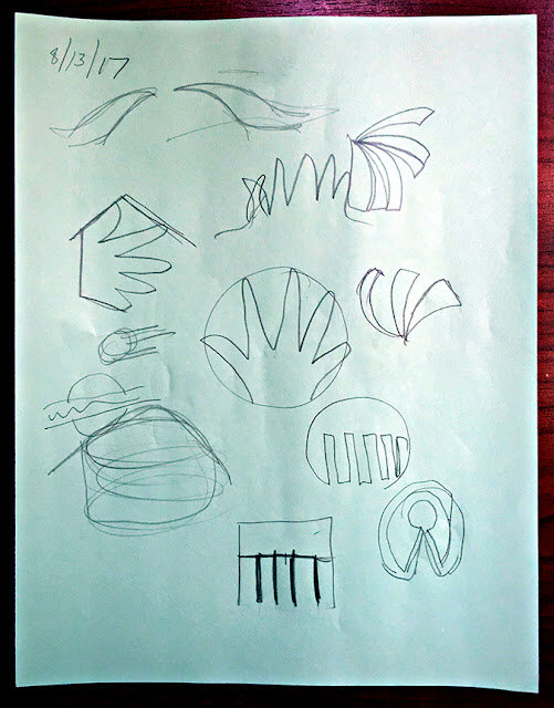
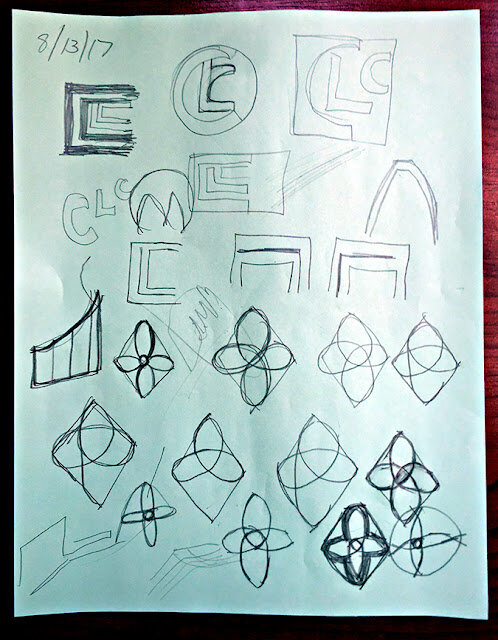
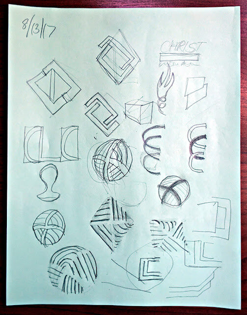
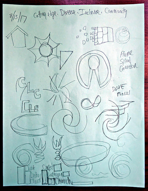
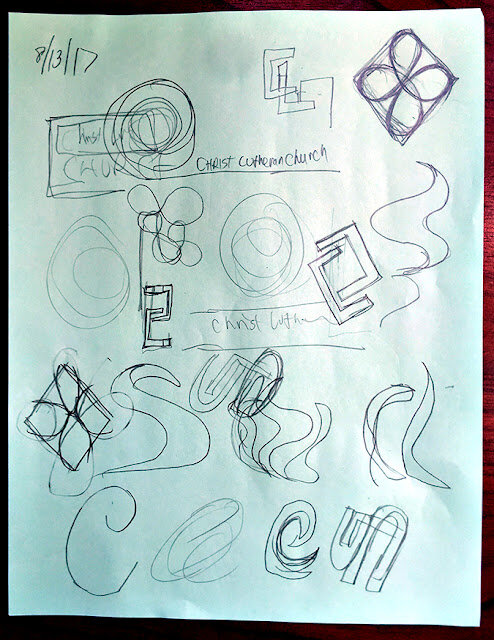
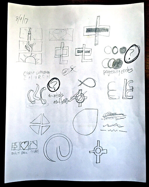
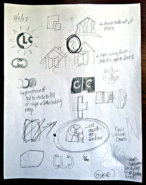
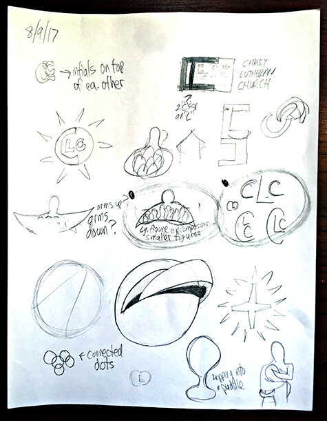
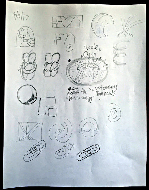
I kept this list in mind as I did these thumbnails and brainstorm sketches:


Generating the sketches was the longest and most difficult part of the process. This was the time to put every idea I had down on paper to analyze it and see if it worked. I kept pushing myself to come up with as many ideas as possible and variations on the variations.

After 5 days of spilling out ideas, I determined that I couldn't think of anything else and was beginning to repeat myself. I also know that usually my best ideas are the ones that come out earlier rather than later. I know that I get worse as time goes on, not better.

After taking a 24 hour break from the thumbnails, I returned to them with fresh eyes to pick the best of the bunch to present to the client.

In part 4 of this series, I'll show you the ideas I presented to the client.

If you like this post, leave a comment below (I respond to all comments!) and/or click the "Follow" button on the right! Thanks for reading!

Michael Mentler—Figure Drawing in the Renaissance Tradition


Yep, I did it again! I bought ANOTHER drawing course!

Since I like Michael Mentler's drawings, have his Book of Bones and have studied some of his methods, I thought I'd drop the $167 on his "Michael Mentler: Figure Drawing in the Renaissance Tradition" lessons.

What appeals to me about Mentler is that his approach is time-tested. It's logical that if one wants to draw like the Old Masters that one should study their methods.

Here's what the program offers:
  • How to come up with your own drawing “game plan” so you can take clear steps to achieving a finished drawing you will be proud of
  • See a clear way to understanding the theory behind figure drawing
  • Learn to effortlessly work with FORMS — the building blocks of your drawing
  • Understanding the key to getting “in the Zone” and why THIS is *exactly* where your biggest breakthroughs will come from
  • The tools and tricks Mentler uses to SUBTRACT various elements from the drawing — and the strange reason this is so helpful in your work 
  • The CRITICAL mistakes artists make in the beginning — and how you can avoid them and make faster progress in your drawings
  • All the measurement systems you need to know to establish the correct proportions of the head, arms, torso, hips, and more 
  • Why using comparative measurements can make things 10 times easier on you
  • The secret to drawing the head from multiple angles and how to establish the right proportions for the eye sockets, cranium, cheekbones, mouth, nose, and more
  • How to use a “wireframe” to draw from multiple angles
  • What you probably don’t know about the KEY differences between drawing men and women
  • How to tap into your intuition, freeing yourself up to GROW and learn new and exciting things with each drawing you create
  • How to use the line of gravity, balance, and rhythm to make your figure drawings more lifelike
I've just started the first lesson called "Demonstration–LIFE" and will summarize it once I've completed it.

If you like this post and blog, click the blue button on the right to become a Follower! And leave a comment below. I respond to all comments.

Thanks for reading!

642 Things to Draw—#001: A rolling pin


I bought this book back in 2011 when I knew I wanted to draw things but didn't know what to draw. And since I didn't know what to draw, I was paralyzed by indecision and of course ended up drawing absolutely nothing!

So if you're like me and suffer from drawing paralysis, I recommend this book or lists like this or this that you can easily find for free online. This book and these lists will do the thinking for you and all YOU have to do is commit to drawing the items on the list!

I'm going to share the drawings I do to encourage me to stick to a regular, preferably daily, schedule of drawing.

The first object I drew was a rolling pin. Notice that the date on this was Feb. 12-13, 2011. I did it while staying at the Betsy Hotel on Ocean Drive in South Beach, Miami, Florida.


If you like this post and blog, click the blue button on the right to become a Follower! And leave a comment below. I respond to all comments.

Thanks for reading!

Don't Break the Chain—Passed the First Milestone!

I talked in this post about developing the habit of daily practice.

According to the science, it takes 66 days for a habit to be hardwired into the brain. The first phase of the Habit Installation Protocol is the Destruction phase and it's 22 days.

I made it through the first 22 days of my daily drawing habit!


It wasn't that difficult, actually. Ninety percent of my dreams and plans depend on me drawing better including knowing anatomy. This is THE key to my dreams so I'm taking it seriously.

Here's something important I noticed: there were many days when I was tired and hadn't drawn yet but I still pulled out a pencil and did something before going to sleep. The mere act of STARTING temporarily got me past the fatigue and I found that once I started I didn't want to stop!

I'm now ready to start phase 2, the Confusion phase. I'm curious to see if it actually does feel confusing or if it's simply another 22 days of the previous phase.

If you like this post and blog, click the blue button on the right to become a Follower! And leave a comment below. I respond to all comments.

Thanks for reading!

NY Comic Book & Graphic Novel Creators Meetup presents Robyn Chapman


On January 10, 2018, I had the pleasure of attending my first NY Comic Book & Graphic Novel Creators meetup.

The meetup organizer was Ramon Gil, "writer of comics and publisher of 'Scifies,'" Creative Director at the graphic design company Fresh Concentrate and design teacher at SUNY/Fashion Institute of Technology. The meetup's guest speaker was Robyn Chapman, Associate Editor at First Second Books.

Ramon asked excellent questions and Robyn gave honest and insightful answers.

Here are my takeaways from the evening:
  • Despite having attended art school and having a love for creating comics, Robyn instead went into publishing because she didn't feel she could be sufficiently prolific to make a living as a cartoonist. She said she she draws too slowly!
  • The middle grades (tweeners) are her company's biggest market for graphic novels. Those projects tend to be real life stories.
  • Advice to artists: don't be thin-skinned. Be able to take criticism. Be able to do the work quickly. Don't be a drama queen.
  • If you want to be considered to do a project, it helps to have a body of work that proves you can do the work, like a long-running web comic or an anthology.
  • It's best to have a relationship in advance with an editor at the publishing house to which you're submitting. A huge fan base for the web comic isn't necessary to be considered for a drawing job. SPEED is the most important quality they're looking for to do 124 pages of a 128 page book. BUT it is less of a risk for the publisher to use an artist with a big fan base because that name recognition helps with getting pre-orders for the final product.
  • Also helps to have an agent because agents and editors already have a relationship. An editor will definitely look at a submission from an agent (to maintain the relationship) but will take a long time to look at a blind submission, if they look at it at all.
  • If do send a blind submission/pitch, send only by email to the correct address. Include a synopsis of the author of the work and samples of finished pages. Make it easy to view the samples because the editor probably won't read the entire contents of the email. Add links to your work but make sure the links work and aren't password protected. There are examples of pitches online so best to check those before sending yours.
  • If you make a web comic that you see being printed later, make sure the original comic is in a format that can be transferred to a page size for printing. 
After the talk was some mingling but I was too tired to participate despite the group's friendliness and enthusiasm for the topic (the downside of being a member of the 5AM Club is that you start to fall asleep at 8:30 or 9pm).

I intend to get to know the members at the next meetup on Feb. 7. The guest will be Christopher Allo, artists' rep, consultant and former talent manager at Marvel Comics.


Chris will be talking about his work, how to break into the industry and will be giving some art work pointers. And if you email Ramon your art by Feb. 2, Chris will critique it for you!

If you live in the NYC area and are interested in creating comics and graphic novels, I recommend joining this meetup. Ramon is established in the industry and therefore gets some great guest speakers!

If you like this post and blog,click the blue button on the right to become a Follower! And leave a comment below. I respond to all comments.

Thanks for reading!

Designing a Logo—Step 2: Word Associations

In the first step of designing a logo, I did some research.

For the second step, I did some word associations to brainstorm ideas. I like to begin with words before pictures because I think the words help to generate more pictures.


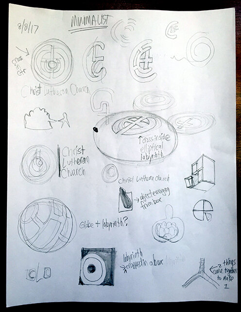
I continued with a Before/During/After exercise:


I started thinking about which typefaces would best suit this project and made a list of "common" church logo motifs to try to avoid :


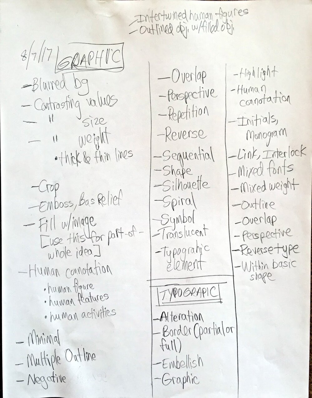
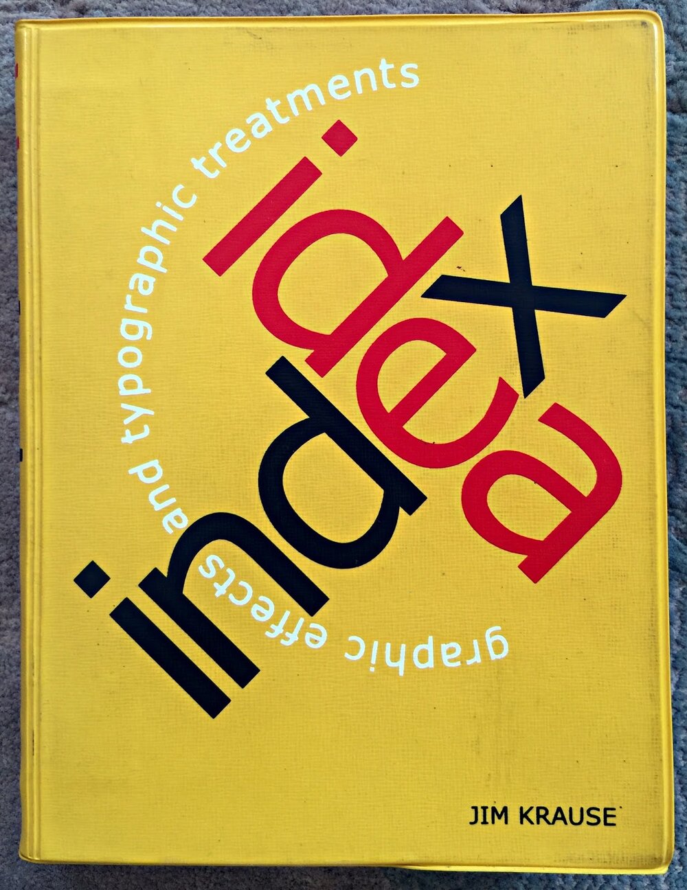
Finally, I made a list of the various approaches that I could apply to this logo. These approaches I got from the book Idea Index by Jim Krause (no relation, I think.):


I determined that I was done with this step once the ideas stopped flowing.

Then it was on to the third step, thumbnail sketches!

If you like this post, leave a comment below (I respond to all comments!) and/or click the "Follow" button on the right! Thanks for reading!
Don't Break the Chain—Closing in on the First Milestone


As of this posting, I have worked on both anatomy and drawing an object every day of this month!

My goal is to do 22 consecutive days of this work to power through the "destruction" phase of instilling a goal. If I can draw every day through Friday, Jan. 19 (the first square marked in red), I will have made it! I will have destroyed my desire to be lazy or procrastinate or judge my work before it's ready to be judged and just KEPT DRAWING!

After Friday, I move on to the next 22 days (the second square marked in red on Sat. Feb. 10) which is the "confusion" phase.

KEEP PRACTICING!

If you like this post, leave a comment below (I respond to all comments!) and/or click the "Follow" button on the right! Thanks for reading!
Anatomy Practice Drawings

The 3 major masses and spine copied from Proko Skelly poses:


Keep drawing, everybody! It's the only way to get better!

If you like this post, leave a comment below (I respond to all comments!) and/or click the "Follow" button on the right! Thanks for reading!

Let's Talk DISCIPLINE


In the last post, I said that in order to achieve my post-project goals, I need to re-establish the DISCIPLINE that I had for 2 years while working on A Universe of Trouble.

I've been studying anatomy through Stan Prokopenko's course and have struggled to be consistently focused on it.

To get back to that single-minded focus I had for A Universe of Trouble, I turned to one of my favorite self-improvement experts, Robin Sharma. I like his presentation and his ability to present real-world, actionable ideas for the average person to use.

One of his productivity methods is called "The Habit Installation Protocol."


It takes 66 days for the human brain to hardwire a new habit to the point of automaticity, that point at which you perform the habit with ease and without thinking about it.

Arriving at that 66th day involves getting through three periods: Destruction, Confusion and Integration.


Sharma breaks each period into 20 days (although 22 makes more sense if they're to add up to 66). Death of our old limitations occurs during the Destruction phase. That's the phase I'm in now regarding my pelvis studies. I'm determined to do 22 consecutive days of pelvis drawings to get so I can completely destroy my old habit of slacking in doing my practice and studies.

Once I get through the Destruction phase, I'll be in the Confusion phase. Confusion is not a bad sign. It’s a sign of growth. Chaos is the next level of world-class coming to get us. We need to embrace the messiness because that’s where the expansion lives. Then once we get to the Integration phase, it'll be easy peesy!

If you're struggling to focus on completing a task, keep this Habit Installation Protocol in mind. It could help you achieve your goals.

If you like this post, leave a comment below (I respond to all comments!) and/or click the "Follow" button on the right! Thanks for reading!
Facing a Fear—Drawing From Imagination

I've spent a lot of time learning—or trying to learn—drawing fundamentals so that I can accurately draw the ideas in my head.

As a result, I do almost no drawing from imagination.

But the more I see of other people's work, like that of Boulet, the more I want to apply whatever skills I presently have to doing more imaginative drawing. Also, I think doing these drawings will mitigate the drudgery of learning to draw (yes, learning to draw can be both fun and tedious.)

I have a tendency to think TOO big sometimes so I forced myself to come up with a simple way to do daily and regular imaginative drawings. I came up with three ways.

First, I will make all of my greeting cards this year. That means birthdays, Valentine's Day, anniversary and Christmas I will do handmade cards like this:


Second, any opportunity to do a quick drawing that expresses an idea I will do, like this reminder to my companion about preparing the challah bread for French toast:


Third, I'm committing to doing daily drawings from 642 Things to Draw book like this:


I'm convinced that doing these small, either daily or at regular interval drawings will prevent me from becoming bored with the monotony of the anatomy studies. Plus I'll gain the skill of being able to draw objects and animals.

I realized that I've been talking the talk of being committed to drawing practice and studying since completing my project in April, 2016 but I realized that I'm NOT walking the walk.

In other words, I realized that I have no DISCIPLINE.

Discipline is a habit and I need to instill that habit. To do that, I turned to self-improvement and leadership expert Robin Sharma.

In my next post, I'll explain Robin Sharma's method for instilling a new habit.

If you like this post, leave a comment below (I respond to all comments!) and/or click the "Follow" button on the right! Thanks for reading!
HAPPY NEW YEAR!


Happy New Year everyone!

First, thank you to those who are following my blog. I deeply appreciate your interest and I will continue to make this blog worth your while.

Second, I wish all of you a healthy, happy and prosperous new year! If you've made resolutions or goals, I hope you achieve them.

And speaking of goals, here are mine for 2018:

  1. Completely learn human anatomy, from the torso to the feet (I'm excluding head and neck because that's another area of study in itself, especially learning the planes of the head.) Stan Prokopenko's coming out with his legs series this month!
  2. Consistent exercise and bicycling

  3. LOTS of drawing that will include making my own greeting cards for occasions instead of buying them and drawing one object daily from the 642 Things to Draw book.


  4. Develop at least ONE animated tv series idea.
  5. Get out of my room more and meet some real live people!
  6. Learn to surf! Yes, you CAN surf in New York City!

Yep, I'm aiming high so if I miss, I'll still have accomplished a lot.

If you like this post, become a follower by clicking the button to the right! Thanks!

Designing a Logo—Step 1: Research

Recently a high school classmate contacted me asking if I'd design a logo for his church. Thankfully he said this was a paying job which brings me to a point.

With a few exceptions, I strongly believe that artists should ALWAYS charge for their work. If we don't charge for the work we do, the work is diminished. I can't tell you how many times I've been asked to do a lot of art work for no pay. In the past I accepted those jobs but those days are over.

ALWAYS CHARGE FOR YOUR WORK, EVEN IF IT'S A SMALL AMOUNT!

OK, rant over!

My friend gave me some ideas and information about his church and the goals they wanted to achieve with the logo.

I didn't tell him that I've NEVER designed a logo for a genuinely professional situation but hey, he didn't need to know that, right?

Since this was a relatively new experience, I did some research to ensure that I completed this job as professionally as possible.

First, I looked up logo design best practices. I got a lot of great and helpful hints on how to proceed.

Once I knew this, I researched church logos and my friend's church specifically.

That research turned out to be essential because I learned an important piece of info about the church that wasn't told to me until much later in the process.

By looking up the church online, I discovered that on its property is a meditation garden that contains a stone labyrinth.


Once I learned that, I knew that a labyrinth had to be one of the design ideas! I was especially excited about this because I wanted to stay away from the common church symbols (steeple, cross, bible) that other church logos had used.

So my first suggestion for making a logo is: do your research! Spend as much time on this step as you need. Because this is the step that's going to get you the ideas that you execute later.

Modified Mentler Pelvis Grids

In this previous post I explained how using the Michael Mentler pelvis grids got me close to a proportionally correct drawing but not completely correct.

By placing his grids over pictures of real pelvises, I could see where his grid was off and make adjustments.

Here's the result:


After doing all of this measuring, however, I realized how time-consuming it is. Also, these grids are only for front-neutral and profile positions. What would I do if the pelvis was in another position?

That's when I decided on another approach to learning the intricacies fo the pelvis: just draw them, male and female, every day from every angle until it's embedded in my memory. I discovered that my drawings work best if I start with the placement of the sacrum; then do the inlet; then the rest.

Yup, it's that simple. And Proko's premium account helps a lot by providing images of the male and female pelvises in almost every conceivable position in addition to an online 3D tool that allows one to position both pelvises in any way:


For me, this is the best way to learn and understand the pelvis. By doing lots of drawings in lost of positions, I'll develop a feel for the parts, proportions and the sex differences between the pelvises. Then when I place the pelvis in a figure or conjure one from imagination, it's structure will come to me instinctively.

I Ordered A Modbook!

Part of doing the Proko Anatomy of the Human Body for Artists curriculum involves using a tablet to digitally draw over images.

To do this, I'm currently using a Wacom Intuos Pen & Touch Small tablet and Adobe Photoshop. It's become frustrating, however, because I've never gotten used to my hand drawing in one place and me looking in another.

So when I discovered that there is a Mac-based tablet AND computer, I was excited! This is the ONE gadget I genuinely need—and want—more than anything else (OK, except a smartphone. I was REALLY excited when the smartphone came out and I didn't have to carry both a flip phone and a palm pilot.)

Why hadn't I heard of the Modbook before? It's been around since 2008 and is a brand of a pen-enabled Mac tablet computers. It's an aftermarket Mac conversion based on certain models of the Macbook and Macbook Pro product lines manufactured by Apple.

Despite having just purchased a new iMac, I decided that the Modbook is worth the price since it will allow me the tablet and portability I so miss with the iMac. It will also make doing storyboards and animation a lot easier than my current system.

As I often do, I impulsively purchased one! Here's what I ordered:


I was impressed that Modbook contacted me 2 1/2 weeks after the order was placed to inform me that a vendor issue was delaying the harddrive. As a result, I was upgraded from a 480GB harddrive to a 750GB. Now that's what I call customer service!

In my haste to order, however, I didn't notice that the Mac OS wasn't the most recent. In fact, it's several generations behind. And I didn't notice this until weeks after placing the order.

I sent a concerned email to Modbook and they got back to me promptly. They explained that my order's current delay is due to them working on getting the most current OS operating on the computer. I wrote them back to please take the time they need to get this right because the computer will be of little use to me without the most recent, or close to recent, OS.

As of this writing (Dec. 17) I still have not received my Modbook ordered on Oct. 13. This does NOT bother me. This computer could be exactly what I need and I'm willing to wait as long as necessary for it to be right.

When I do finally get my Modbook, I'll make an unboxing video. Keep a lookout for it!