The first step of designing a logo was research.
The second step was word associations to brainstorm ideas.
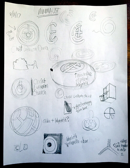
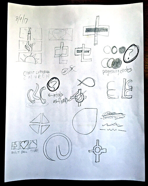
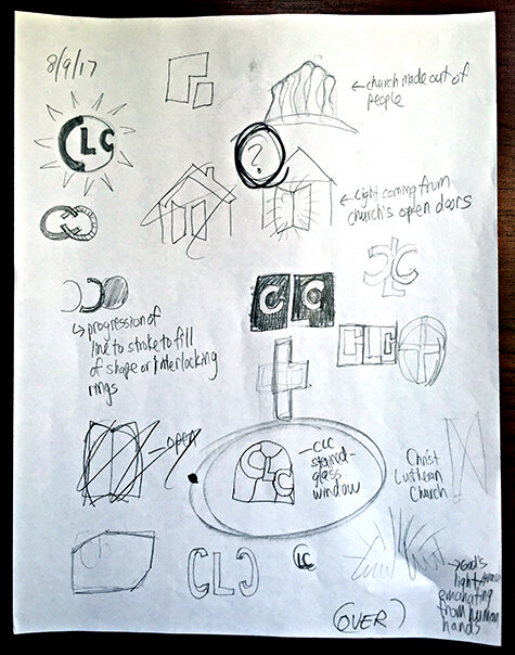
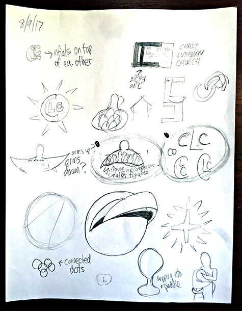
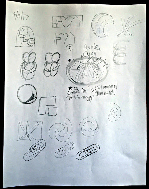
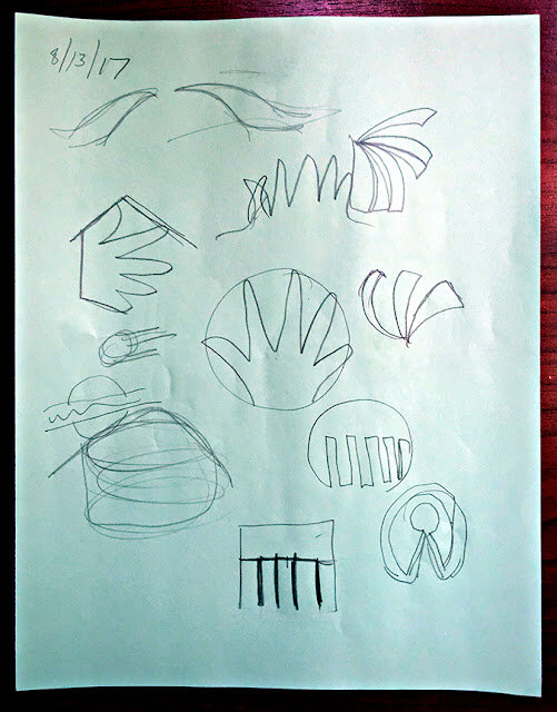
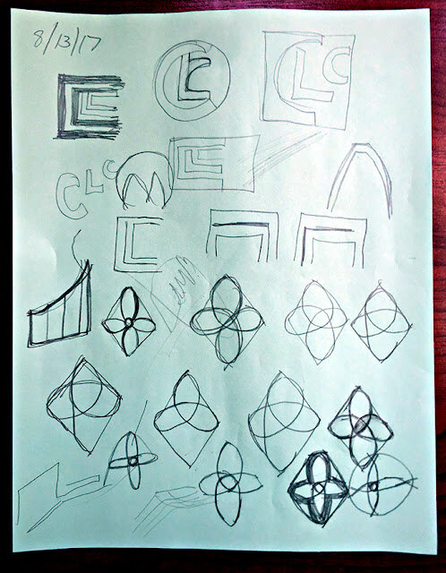
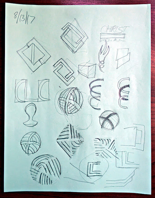
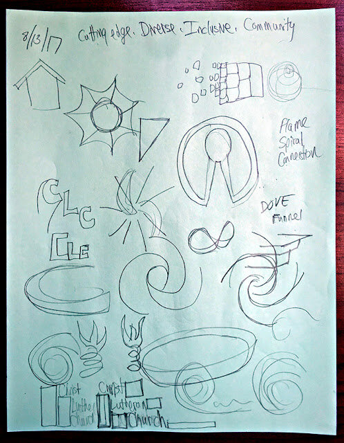
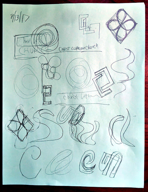
The third step is thumbnail sketches.
Before doing these sketches, I looked up "logo design." I came across this list which was incredibly helpful in guiding my process:
The second step was word associations to brainstorm ideas.
The third step is thumbnail sketches.
Before doing these sketches, I looked up "logo design." I came across this list which was incredibly helpful in guiding my process:
- Do not use more than three colors.
- Get rid of everything that is not absolutely necessary.
- Type must be easy enough for your grandma to read.
- The logo must be recognizable.
- Create a unique shape or layout for the logo.
- Completely ignore what your parents and/or spouse think about the design.
- Confirm that the logo looks appealing to more than just three (3) individuals.
- Do not combine elements from popular logos and claim it as original work.
- Do not use clipart under any circumstances.
- The logo should look good in black and white.
- Make sure that the logo is recognizable when inverted.
- Make sure that the logo is recognizable when resized.
- If the logo contains an icon or symbol, as well as text, place each so that they complement one another.
- Avoid recent logo design trends. Instead, make the logo look timeless.
- Do not use special effects (including, but not limited to: gradients, drop shadows, reflections, and light bursts).
- Fit the logo into a square layout if possible, avoid obscure layouts.
- Avoid intricate details.
- Consider the different places and ways that the logo will be presented.
- Invoke feelings of being bold and confident, never dull and weak.
- Realize that you will not create a perfect logo.
- Use sharp lines for sharp businesses, smooth lines for smooth businesses.
- The logo must have some connection to what it is representing.
- A photo does not make a logo.
- You must surprise customers with presentation.
- Do not use more than two fonts.
- Each element of the logo needs to be aligned. Left, center, right, top, or bottom.
- The logo should look solid, with no trailing elements.
- Know who is going to be looking at the logo before you think of ideas for it.
- Always choose function over innovation.
- If the brand name is memorable, the brand name should be the logo.
- The logo should be recognizable when mirrored.
- Even large companies need small logos.
- Everyone should like the logo design, not just the business that will use it.
- Create variations. The more variations, the more likely you are to get it right.
- The logo must look consistent across multiple platforms.
- The logo must be easy to describe.
- Do not use taglines in the logo.
- Sketch out ideas using paper and pencil before working on a computer.
- Keep the design simple.
- Do not use any “swoosh” or “globe”symbols.
- The logo should not be distracting.
- It should be honest in its representation.
- The logo should be balanced visually.
- Avoid bright, neon colors and dark, dull colors.
- The logo must not break any of the above rules.
I kept this list in mind as I did these thumbnails and brainstorm sketches:
Generating the sketches was the longest and most difficult part of the process. This was the time to put every idea I had down on paper to analyze it and see if it worked. I kept pushing myself to come up with as many ideas as possible and variations on the variations.
After 5 days of spilling out ideas, I determined that I couldn't think of anything else and was beginning to repeat myself. I also know that usually my best ideas are the ones that come out earlier rather than later. I know that I get worse as time goes on, not better.
After taking a 24 hour break from the thumbnails, I returned to them with fresh eyes to pick the best of the bunch to present to the client.
In part 4 of this series, I'll show you the ideas I presented to the client.
If you like this post, leave a comment below (I respond to all comments!) and/or click the "Follow" button on the right! Thanks for reading!

