The first step of designing a logo was research.
The second step was word associations to brainstorm ideas.
The third step was thumbnail sketches.
The fourth step was designs in black and white.
The fifth step was designs in black and white feedback and revisions.
The sixth step was designs in black and white feedback and revisions part 2.
The seventh step was a disagreement in direction.
The eighth step was a breakthrough.
The ninth step was getting back on track.
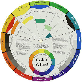
Now it's time for color!
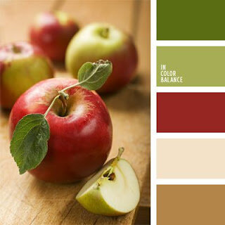
The client and I agreed that earth tones would be best. To avoid wasting time, I sent swatch ideas and requested feedback of their opinions of these colors:
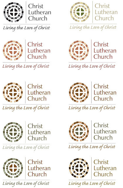
They got back to me with their preferences and I applied theirs and mine to the next proof:
In the next installment, we'll see how the client responded to these first color choices.
If you like this post and blog, click the blue "Follow" button on the right to become a Follower! And leave a comment below. I respond to all comments.
Thanks for reading!


